Bandwidth & Traffic
更新时间:2022-06-24 15:42:21
• Entrance
Product → Statistical Analysis → Usage Statistics → Bandwidth & Traffic
• Introduction
Bandwidth & Traffic offers you the situation of bandwidth and traffic utilization from the edge, origin servers and relays over time. Besides, it also provides statistics of peak utilization, average utilization, and aggregate data transferred in the given time range. All 3 types of bandwidth & traffic share the same query requirement which only accepts date range that span 1-31 days and you can trace back to data generated 2 years ago farthest.

1 Overall trend
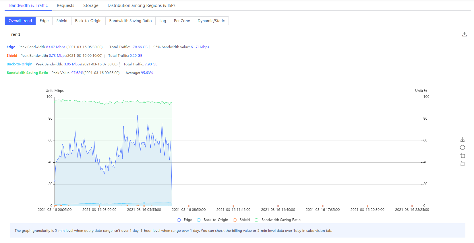
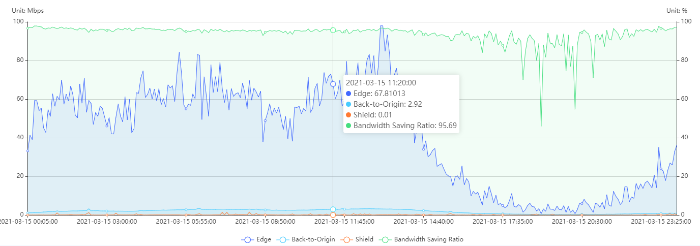
This chart contains the data of edge, shield, back to origin, and bandwidth saving ratio. Here you can see the trend comparison chart of the four types of data.
When mouse approaches to the chart, a floating window will show up for reveal the details of the data point.
It should be noted that when the query time range is within one day, the chart data granularity is 5 minutes, and the bandwidth peak is displayed. When the query time range is beyond one day, the data granularity is 1 hour, and the bandwidth peak is not displayed,and you can check the billing value or 5-min level data over 1day in subdivision tab

2 Edge
Edge is consisting of three parts, which are Trend, Daily Data, and Type Percentage.
• Trend
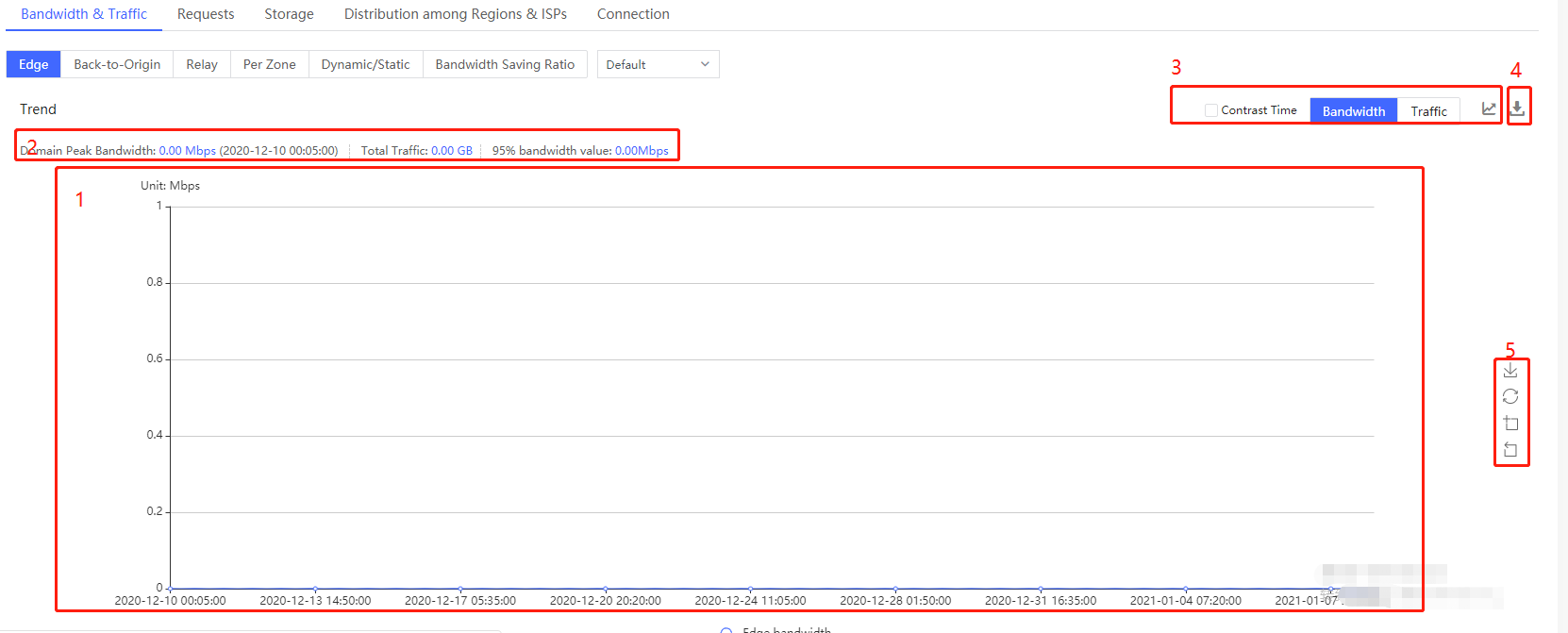
A line chart (1) is presented here for you to discern the trend of edge bandwidth over time. The vertical axis is in Mbps, and the horizontal axis reveals data in a granularity of 5-minute level. In detail, the value of every single point in the chart is the average number of bandwidths used during the previous 5-minute, e.g. the bandwidth value of 00:05:00 is the mean number of bandwidths generated from 00:00:00 to 00:04:59.
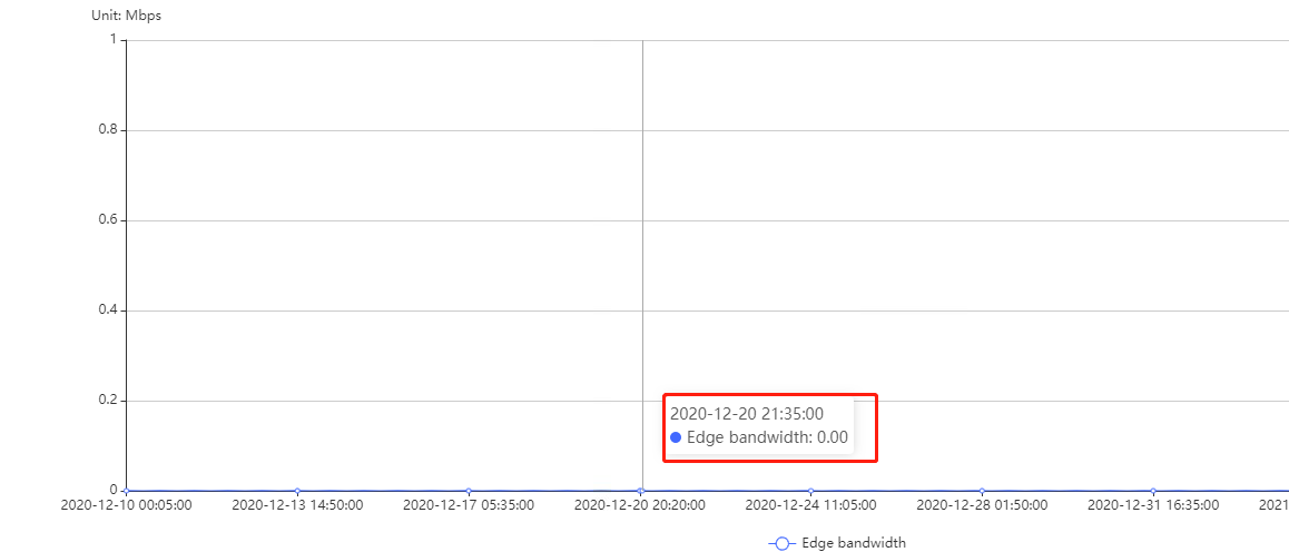
When mouse approaches to the chart, a floating window will show up for reveal the details of the data point. Additionally, icons (5) on the right side of the line chart enable you to save the chart as a picture, as well as reset, zoom in and unzoom the chart.
Moreover, you can access the information of the peak edge bandwidth value of query domains and its time (2) accordingly as well as the total traffic value of given domains.
By ticking the “Contrast Time” check box (3) on the upper right of the line chart as well as choose a time period which is different from current given time and should be within a day, a comparison of edge bandwidth trend between 2 different periods of time will be shown in the line chart. You can zoom in and out the line chart by scrolling the bar on its left side.
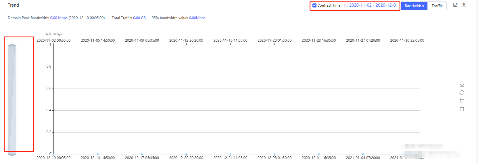
There is an export icon (4) next to contrast time which allows you to download the data of the line chart as an excel document contains time (5-minute granularity) and Edge bandwidth (Mbps).
• Daily Data
Daily data displays total edge traffic, peak bandwidth and the time when it reaches its maximum number by taking a day as a period. Date is arranged in a descending order. In addition, you are allowed to export data comprised of strings as date, bandwidth peak time, peak bandwidth and total traffic from this part by clicking the download icon on the upper right side of it.

3 Origin
Origin is consisting of trend and daily data. Origin bandwidth presents the statistical details of bandwidth generated by accelerated domains at origin servers.
• Trend
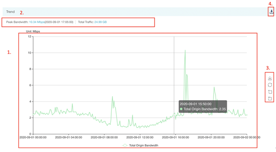
The trend of origin bandwidth over time is illustrated by a line chart (1). The vertical axis is in Mbps, and the horizontal axis reveals data in a granularity of 5-minute level. In detail, the value of every single point in the chart is the mean of bandwidth used during the previous 5-minute. Icons (2) on the right side of the line chart enable you to save the chart as a picture, as well as reset, zoom in and zoom out the chart.
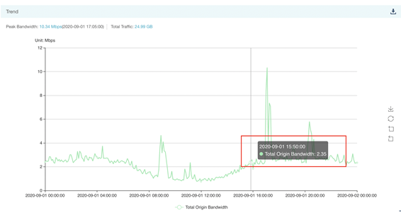
Besides, a floating window will also appear when mouse get close to the line.
Peak origin bandwidth and its time together with total origin traffic (3) are shown over the line chart. On the top right-hand corner, there is a download icon (4) for you to export data of origin bandwidth trend, including time (5-minute granularity) and corresponding bandwidth.
• Daily Data
User can check the value of origin peak bandwidth and its time, as well as total traffic here in a daily basis. Date is arranged in a descending order.

4 Shield
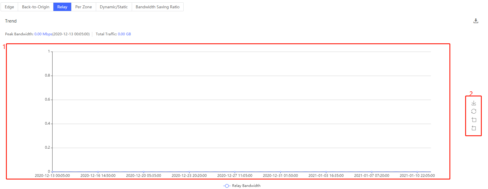
Shield is consisting of trend and daily data. Shield bandwidth presents the statistical details of bandwidth generated by accelerated domains at origin servers.
5 Bandwidth Saving Ratio
Bandwidth Saving Ratio is consisting of trend and daily data. Bandwidth Saving Ratio presents the statistical details of bandwidth generated by accelerated domains at origin servers.
• Trend
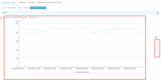
The trend of Bandwidth Saving Ratio over time is illustrated by a line chart (1). The vertical axis is in percentage(%), and the horizontal axis reveals data in a granularity of 5-minute level. In detail, the value of every single point in the chart is the mean of bandwidth used during the previous 5-minute. Icons (2) on the right side of the line chart enable you to save the chart as a picture, as well as reset, zoom in and zoom out the chart.
• Daily Data
User can check the value of Bandwidth Saving Ratio and its time, as well as average value of Bandwidth Saving Ratio here in a daily basis. Date is arranged in descending order.
